Data Visualisation · Critique & Redesign
Women Scientists & Engineers — Share by Country
A critique of the busy dot-density original and two clean redesigns that turn a wall of dots into a precise, sortable ranking — each evaluated through one six-lens framework.
- Dataset
- Share of women among scientists and engineers (%), EU, 2018
- Source
- Eurostat (Science, technology & innovation), via the assignment brief
- Method
- Charts and written critique generated with AI from the provided dataset, then reviewed and refined.
Key finding
Across the EU about 40.1% of scientists and engineers are women, but the range is wide — Lithuania tops the list near 58% while Luxembourg sits lowest. The original makes that share something you estimate from a field of dots rather than read.
The six-lens framework
A reusable checklist applied to every chart below, moving from purpose down to detail.
01Purpose & Audience
- What single question does this visual answer? If you can't name one, it's doing too much.
- Who is the audience, and does the design match their data literacy and decisions?
- Why does it matter — what value or action does it enable?
02Honesty & Completeness
- Does it show all the relevant data, and only the data?
- Are axes, baselines, and scales truthful (e.g. bars starting at zero)?
- Would the numbers, plotted differently, tell a contradictory story? (the Anscombe test)
03Encoding & Chart Choice
- Is the chart type right for the data type and number of variables?
- Does it use accurate, pre-attentive channels (position, length) for the key comparison?
- Could the key insight be read in a single glance — does it pop out?
04Clarity over Decoration
- Is every element earning its place, or is there chart junk (3-D, heavy gridlines, borders)?
- Is form serving function, or has cleverness gotten in the way?
- Are labels, titles, and precision levels appropriate?
05Colour & Accessibility
- Does colour have a specific purpose (sequence, divergence, category, highlight) or is it decorative?
- Is the palette robust to colour-vision deficiency, with redundant encodings (shape + colour)?
- Is contrast sufficient and the palette consistent?
06Layout & Flow
- Does the layout respect natural reading order, with the most important content where attention lands first?
- Is there a logical flow connecting the components?
- Is the right level of interactivity offered (view-only vs drill-able)?
01 The original
Critique of the original
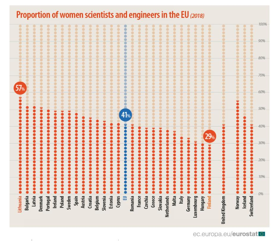
- Purpose & AudienceCaveat
- It answers “what share of scientists and engineers are women?”, but the dot-density form makes that share something the eye estimates rather than reads.
- Honesty & CompletenessCaveat
- Each dot represents a quantum of people, so the encoding is honest in spirit, but counting dots to recover a percentage is imprecise, and only three countries are actually labelled.
- Encoding & Chart ChoiceFail
- A stacked field of dots is a weak channel for reading a single proportion — a bar on a common axis would let you read and rank every country in a glance.
- Clarity over DecorationFail
- Dozens of dot-columns are high-ink and low-precision: a great deal of decoration carrying numbers a plain bar would simply state.
- Colour & AccessibilityCaveat
- Warm dots with three highlighted bubbles (57%, 41%, 29%) pull the eye to the extremes, but the rest of the countries blur into an undifferentiated wash.
- Layout & FlowCaveat
- Countries are ordered, which helps, but the dot-columns make the middle of the pack almost impossible to compare precisely.
Assessment of the original — in detail
The underlying figure is a single percentage per country, but the original renders it as a dense field of dots — visually striking, and stubbornly imprecise to read.
Purpose & audience. The question is a good one — in which countries are women best represented among scientists and engineers? — and the chart does establish a ranking. But by encoding each share as a tall stack of dots, it turns “what is the exact share?” into a counting exercise, and only the headline countries are spelled out. Honesty & completeness. There is an honesty to dot-density: each dot stands for real people, and nothing is truncated. The problem is recoverability — to read Austria's share you would have to count its dots, which no reader will do, so in practice the precise values are inaccessible everywhere except the three labelled bubbles. Encoding & chart choice. This is the core failure. A proportion is read most accurately as a length or a position on a common axis; a column of dots is one of the weakest channels for the job. The chart spends enormous visual effort to convey numbers a simple sorted bar would make instantly legible and comparable.
Clarity over decoration. The data-ink ratio is poor: the dots are the decoration and the data at once, but they carry far less information per drop of ink than a bar would. The overall texture is busy, and busy is exactly what a single-number-per-country chart should never be. Colour & accessibility. Colour is used to spotlight three countries, which does guide the eye to the leaders and laggards. But everything between them shares the same warm wash, so colour can't help rank or distinguish the bulk of the field, and a colour-blind reader loses even the highlight contrast. Layout & flow. Ordering the countries is the right instinct and gives a usable left-to-right flow. But the dot-column form means the eye can only really trust the extremes; the dozens of countries in the middle are a near-tie that the chart can't resolve.
Compute each country's female share and the wall of dots collapses into a clean ranking. The two redesigns below do that — a sorted bar for exact reading, and a dot plot that keeps the “dot” spirit while making every value precise.
02 Redesigns
Two ways to fix it
Two clean takes on the same ranking: a sorted horizontal bar with direct value labels, and a dot plot that keeps the “dot” spirit while making every value precise.
Redesign 1 — Horizontal bar (ranking)
Scored against the framework
- Purpose & AudiencePass
- One question, plainly answered: rank the countries by women's share of scientists and engineers.
- Honesty & CompletenessPass
- Zero baseline, true lengths, every country shown, with the EU average in the ranking as a reference.
- Encoding & Chart ChoicePass
- Bar length on a common axis is the accurate channel; each share is labelled directly so nothing is estimated.
- Clarity over DecorationPass
- Flat bars and one label each — no dot fields, no busy texture.
- Colour & AccessibilityPass
- A single restrained hue; order and length carry the meaning.
- Layout & FlowPass
- Sorted top-to-bottom, horizontal so the long country names read cleanly, with hover for the exact figure.
Assessment — in detail
The horizontal bar takes the percentage the original made you estimate and simply states it, sorted, for every country.
Purpose & audience. It answers the ranking question directly: who is closest to parity and who is furthest. A reader sees at a glance that the Baltics and Bulgaria sit near or above half, while Finland, Hungary and Luxembourg trail — the comparison the dot field could only hint at. Honesty & completeness. Every country is present, each bar starts at zero, and the EU average is one bar among the rest rather than a floating highlight, so it can be compared fairly with its members. Encoding & chart choice. A single proportion per country is the textbook case for a bar. Length on a shared baseline is the most accurate encoding available, and a direct value label means the exact share is read, not counted.
Clarity over decoration. There is nothing to remove: flat bars, a gridline, one label apiece. The data-ink ratio is high and the ranking is immediate. Colour & accessibility. One quiet hue carries every bar; because rank is in the position and length, colour is free to stay neutral and the chart survives colour-vision deficiency. Layout & flow. Sorted highest to lowest with names on a single readable line, the eye travels down the ranking and hover reveals the precise percentage.
Its only cost is that, like any long bar ranking, the blocks stack up densely — which is exactly where the dot plot offers a lighter alternative.
Redesign 2 — Dot plot (less ink)
Scored against the framework
- Purpose & AudiencePass
- The same ranking question, kept in the “dot” spirit of the original but made precise.
- Honesty & CompletenessPass
- One dot per country at its true share on a zero-based axis — no counting required.
- Encoding & Chart ChoicePass
- Position on a common axis reads as accurately as a bar's end, with a fraction of the ink.
- Clarity over DecorationPass
- A single dot per country replaces a whole column of them — far cleaner than dot-density.
- Colour & AccessibilityPass
- One restrained hue; position and order do the work.
- Layout & FlowCaveat
- Sorted and readable, though without a connecting bar the eye has to travel to the axis to read a value.
Assessment — in detail
The dot plot is a quiet nod to the original — it keeps a single dot per country — but each dot now sits at the country's exact share on a common axis, so the precision the dot-density version lost is restored.
Purpose & audience. It answers the same ranking question and reads especially well across a long list of countries, where a stack of solid bars can feel heavy and a row of dots stays light. Honesty & completeness. Every country appears once, at its true value, on a zero-based axis — none of the dot-counting the original demanded, and nothing dropped. Encoding & chart choice. Value is read from the dot's position on a shared scale, the same accurate channel as a bar's end, using only a single mark per country rather than a whole column of dots.
Clarity over decoration. This is the leanest honest version of the chart: one dot per country and a baseline. The pattern of the ranking — the leaders, the long middle, the trailers — is easy to take in. Colour & accessibility. A single hue is enough; meaning lives in position and order, so the chart is robust to colour-vision deficiency. Layout & flow. Sorted highest to lowest with readable horizontal labels; the only mild cost versus the bar is that, lacking a filled length, the eye must glance to the axis to read an exact value.
Bar and dot plot answer the same question two ways — the bar for reading precise shares, the dot plot for a calm view of a long ranking — and both replace a field of dots that could be admired but never really read.
03 Verdict
Comparison & conclusion
Horizontal bar (ranking)
- Reads the exact share off a directly-labelled bar.
- Honest zero baseline, strong length encoding.
- Weakness: many solid bars stack up densely.
Dot plot (less ink)
- One precise dot per country — airier across a long list.
- Keeps the “dot” spirit of the original but makes it readable.
- Weakness: no filled bar, so the eye glances to the axis.
Form vs. function. The original spent enormous visual effort on dot-columns that carry a single percentage each — striking to look at, impossible to read precisely. Both redesigns put that percentage on a common axis so every country can be read and ranked.
Task-specificity. There is no single “correct” chart: the bar is best for reading exact shares, the dot plot for a calm view of a long ranking. Either recovers the middle of the field the dot density blurred.