Data Visualisation · Critique & Redesign
Business R&D in Manufacturing — by Intensity
A critique of the 100% stacked bars with faint diamond markers, and two redesigns that separate the intensity split from the buried “share of business R&D” figure — each evaluated through one six-lens framework.
- Dataset
- Business R&D in manufacturing by R&D-intensity group (%), 2015
- Source
- OECD Science, Technology and Industry Scoreboard 2017, via the assignment brief
- Method
- Charts and written critique generated with AI from the provided dataset, then reviewed and refined.
Key finding
In the most research-intensive economies — Israel, Korea — around 90% of manufacturing R&D is high-intensity, and manufacturing makes up as much as 90% of business R&D in Korea. The original hides that second figure inside small open diamonds.
The six-lens framework
A reusable checklist applied to every chart below, moving from purpose down to detail.
01Purpose & Audience
- What single question does this visual answer? If you can't name one, it's doing too much.
- Who is the audience, and does the design match their data literacy and decisions?
- Why does it matter — what value or action does it enable?
02Honesty & Completeness
- Does it show all the relevant data, and only the data?
- Are axes, baselines, and scales truthful (e.g. bars starting at zero)?
- Would the numbers, plotted differently, tell a contradictory story? (the Anscombe test)
03Encoding & Chart Choice
- Is the chart type right for the data type and number of variables?
- Does it use accurate, pre-attentive channels (position, length) for the key comparison?
- Could the key insight be read in a single glance — does it pop out?
04Clarity over Decoration
- Is every element earning its place, or is there chart junk (3-D, heavy gridlines, borders)?
- Is form serving function, or has cleverness gotten in the way?
- Are labels, titles, and precision levels appropriate?
05Colour & Accessibility
- Does colour have a specific purpose (sequence, divergence, category, highlight) or is it decorative?
- Is the palette robust to colour-vision deficiency, with redundant encodings (shape + colour)?
- Is contrast sufficient and the palette consistent?
06Layout & Flow
- Does the layout respect natural reading order, with the most important content where attention lands first?
- Is there a logical flow connecting the components?
- Is the right level of interactivity offered (view-only vs drill-able)?
01 The original
Critique of the original
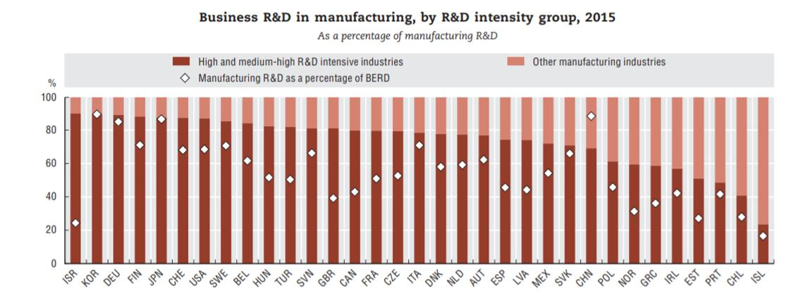
- Purpose & AudienceCaveat
- It packs two stories — the high- vs other-intensity split and manufacturing's share of business R&D — and relegates the second, arguably more interesting one to faint diamond markers.
- Honesty & CompletenessCaveat
- The 100% stacked bars honestly show composition, but overlaying a diamond series measured on a different scale invites the eye to compare two things that aren't comparable.
- Encoding & Chart ChoiceFail
- The most distinctive number — how much of business R&D is in manufacturing — is mapped to the hardest mark to read on the chart: small open diamonds floating over the bars.
- Clarity over DecorationCaveat
- Cleaner than most of the set, but the diamond overlay clutters the bars and belongs to neither of the two stacked segments.
- Colour & AccessibilityCaveat
- Two reds carry the split clearly enough, but the open diamonds are low-contrast and easily lost against the bars and gridlines.
- Layout & FlowCaveat
- Many countries are shown at once, and the diamond series has no clear home on the bar, so the BERD-share story is spread thin and hard to follow.
Assessment of the original — in detail
This is one of the tidier originals in the set, but it still makes a classic mistake: it tries to tell two stories in one chart and hides the more interesting one inside the harder-to-read encoding.
Purpose & audience. There are really two questions here — how is each country's manufacturing R&D split between high- and lower-intensity industries, and how large is manufacturing within total business R&D (BERD)? The stacked bars answer the first cleanly; the second is demoted to a scatter of open diamonds, so a reader has to work to even notice it's there. Honesty & completeness. The 100% stacked bars are an honest way to show composition — the two segments add to the whole. The trouble is the overlay: the diamonds sit on the same 0–100 axis but mean something entirely different (a share of BERD, not of manufacturing R&D), which quietly invites the reader to compare them against the bars as though they were on the same footing. Encoding & chart choice. Composition as a stacked bar is reasonable. The real failure is the BERD-share series: arguably the most newsworthy number on the chart is encoded as small, open, low-contrast diamonds — one of the weakest possible channels — when a simple bar would let you read and rank it instantly.
Clarity over decoration. The chart is not heavily ornamented, but the diamond overlay is clutter of a subtler kind: it adds marks that don't belong to either stacked segment and don't share their meaning, so the eye keeps trying, and failing, to relate them. Colour & accessibility. The two-red split reads acceptably, but the open diamonds have so little contrast that they're easy to miss entirely, and there's no redundant cue (shape aside) to recover them — a poor outcome for what may be the key metric. Layout & flow. With thirty-plus countries and two encodings competing for the same bars, there's no clean reading order for the BERD-share story; it's smeared across the chart as a faint constellation rather than presented as its own ranking.
The fix is simply to separate the two questions. The redesigns below keep the composition split as a clean 100% stacked bar, and lift the buried BERD-share series out into its own sorted bar where it can finally be read.
02 Redesigns
Two ways to fix it
Two charts where the original used one: a clean 100% stacked bar for the intensity split, and a separate ranked bar for the share-of-business-R&D figure the diamonds buried.
Redesign 1 — 100% stacked bar (intensity split)
Scored against the framework
- Purpose & AudiencePass
- One question: how much of each country's manufacturing R&D is in high- and medium-high-intensity industries?
- Honesty & CompletenessPass
- A true 100% composition — the two segments sum to the whole, with no second scale overlaid.
- Encoding & Chart ChoicePass
- Stacked length on a normalized axis is the right channel for part-to-whole, and the split reads at a glance.
- Clarity over DecorationPass
- Two flat segments per bar and nothing else — no diamonds, no floating overlay.
- Colour & AccessibilityPass
- Two consistent hues map to the two intensity groups; colour is doing real, single-purpose work.
- Layout & FlowPass
- Sorted by high-intensity share so the most research-intensive countries anchor the top.
Assessment — in detail
The 100% stacked bar keeps the part of the original that worked — the composition split — and removes the part that didn't, so it does one job cleanly.
Purpose & audience. It answers a single composition question: what share of a country's manufacturing R&D sits in high- and medium-high-intensity industries versus the rest? Israel and Korea sit near 90% high-intensity; others are far more balanced. Honesty & completeness. Because the two segments are a genuine part-to-whole that adds to 100%, normalizing them is honest, and with no second scale overlaid there's nothing to mislead. Encoding & chart choice. Part-to-whole across categories is the textbook case for a 100% stacked bar; the length of each coloured segment reads directly as its share, and the split between the two is a single clean boundary per bar.
Clarity over decoration. Each bar is just two segments — no diamonds, no overlay, no gridline clutter. Every pixel encodes a share. Colour & accessibility. Two distinct hues map one-to-one to the two intensity groups, so colour carries a single, well-defined meaning, reinforced by a matching legend. Layout & flow. Sorting by the high-intensity share gives a meaningful top-to-bottom order, and hover reveals the exact split for any country.
What it deliberately leaves out is the BERD-share figure — the old diamond series — which deserves its own chart rather than a cameo on this one. That's the next redesign.
Redesign 2 — Ranked bar (share of business R&D)
Scored against the framework
- Purpose & AudiencePass
- One question, finally readable: what share of each country's business R&D is in manufacturing?
- Honesty & CompletenessPass
- Zero baseline, true bar lengths, every value labelled — the figure the original hid, shown plainly.
- Encoding & Chart ChoicePass
- A horizontal bar puts the BERD share on a common length axis, the channel the open diamonds should have used all along.
- Clarity over DecorationPass
- Flat bars and one label each — the metric stands on its own with no competing encoding.
- Colour & AccessibilityPass
- A single restrained hue; the ranking is carried by length and order.
- Layout & FlowPass
- Sorted descending so the manufacturing-heavy R&D economies sit at the top.
Assessment — in detail
This redesign does one thing: it takes the buried diamond series and gives it the clear, sorted bar chart it always deserved.
Purpose & audience. It answers the question the original hid — how much of a country's business R&D is concentrated in manufacturing? For anyone thinking about industrial structure, that's often the more telling number, and here it's the whole chart rather than a faint overlay. Honesty & completeness. Each bar starts at zero and is labelled with its exact percentage, so the figure that was previously a low-contrast diamond is now read directly, for every country. Encoding & chart choice. A single value per country is exactly what a bar is for; length on a shared baseline is the accurate channel, and it's precisely the channel the original denied this series by rendering it as small open diamonds.
Clarity over decoration. Flat bars, one label apiece, no overlay — the metric is no longer competing with a stacked composition for the same space. Colour & accessibility. One quiet hue carries the ranking; meaning is in length and order, so the chart is robust to colour-vision deficiency. Layout & flow. Sorted from highest to lowest, the manufacturing-heavy R&D economies anchor the top and the eye travels cleanly down the ranking.
Together the two redesigns separate what the original tangled: the stacked bar answers “what's the intensity split?” and this bar answers “how big is manufacturing in business R&D?” — each legible because it's no longer sharing a chart with the other.
03 Verdict
Comparison & conclusion
100% stacked bar (split)
- Shows the high- vs other-intensity split as a true part-to-whole.
- No second scale overlaid — nothing to mislead.
- Weakness: shows composition only, not the absolute amounts.
Ranked bar (BERD share)
- Lifts the buried diamond series into a readable ranking.
- Zero baseline, length encoding, every value labelled.
- Weakness: a separate chart, so the two stories sit side by side.
Form vs. function. The original wasn't ugly, but it asked one chart to carry two unrelated scales, and put the more interesting number in the least visible mark. Splitting it lets each question use the encoding that suits it.
Task-specificity. There is no single “correct” chart: the stacked bar answers “what's the intensity split?”, the ranked bar answers “how big is manufacturing in business R&D?”. Apart, both are legible; together they were not.