Data Visualisation · Critique & Redesign
OECD Open, Useful & Re-usable Data Index
A critique of the dense stacked-bar original — three components plus 2017 markers — and two redesigns that separate the ranking from the change over time, each evaluated through one six-lens framework.
- Dataset
- OECD OURdata Index, by country, 2017 & 2019
- Source
- OECD (Open, Useful and Re-usable data — OURdata Index 2019), via the assignment brief
- Method
- Charts and written critique generated with AI from the provided dataset, then reviewed and refined.
Key finding
Korea and France lead near 0.93 on the 2019 index; the biggest improver since 2017 is Latvia (+0.36). The original buries both the ranking and the change inside one dense, marker-laden chart.
The six-lens framework
A reusable checklist applied to every chart below, moving from purpose down to detail.
01Purpose & Audience
- What single question does this visual answer? If you can't name one, it's doing too much.
- Who is the audience, and does the design match their data literacy and decisions?
- Why does it matter — what value or action does it enable?
02Honesty & Completeness
- Does it show all the relevant data, and only the data?
- Are axes, baselines, and scales truthful (e.g. bars starting at zero)?
- Would the numbers, plotted differently, tell a contradictory story? (the Anscombe test)
03Encoding & Chart Choice
- Is the chart type right for the data type and number of variables?
- Does it use accurate, pre-attentive channels (position, length) for the key comparison?
- Could the key insight be read in a single glance — does it pop out?
04Clarity over Decoration
- Is every element earning its place, or is there chart junk (3-D, heavy gridlines, borders)?
- Is form serving function, or has cleverness gotten in the way?
- Are labels, titles, and precision levels appropriate?
05Colour & Accessibility
- Does colour have a specific purpose (sequence, divergence, category, highlight) or is it decorative?
- Is the palette robust to colour-vision deficiency, with redundant encodings (shape + colour)?
- Is contrast sufficient and the palette consistent?
06Layout & Flow
- Does the layout respect natural reading order, with the most important content where attention lands first?
- Is there a logical flow connecting the components?
- Is the right level of interactivity offered (view-only vs drill-able)?
01 The original
Critique of the original
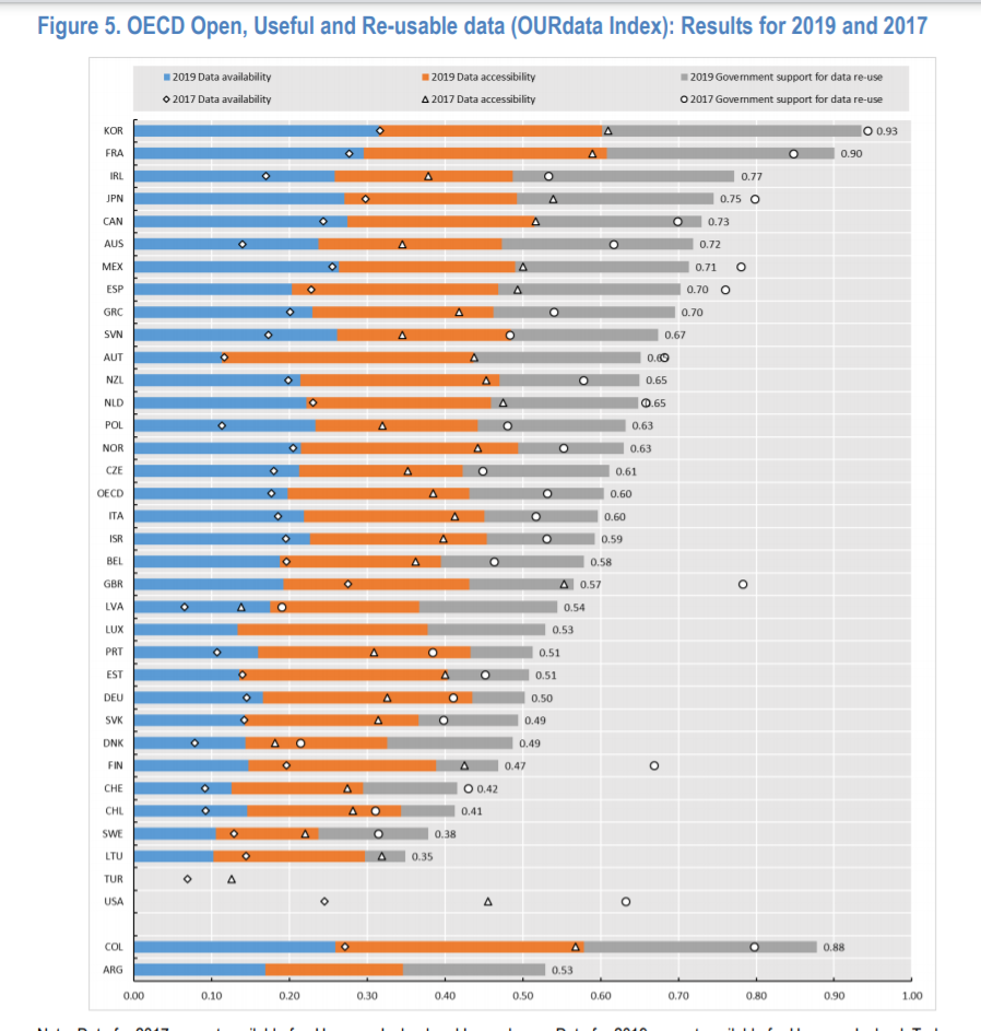
- Purpose & AudienceCaveat
- The question — how open and re-usable is each country's government data? — is good, but overlaying 2017 markers on the 2019 bars muddies it with a second time point.
- Honesty & CompletenessCaveat
- The three stacked components are an honest breakdown of the index, but the prior-year markers sit on the same bar and invite year-on-year reading the stacked form doesn't really support.
- Encoding & Chart ChoiceCaveat
- The headline number — the total index — isn't a single readable length; you have to sum three segments, and the change since 2017 is carried by small markers rather than its own clear channel.
- Clarity over DecorationFail
- Forty countries, three stacked components and two years of markers make a genuinely dense chart where thin segments and small markers do a great deal of low-contrast work.
- Colour & AccessibilityCaveat
- Three component colours plus marker glyphs is a lot of visual vocabulary for one chart, and the markers are easy to lose against the stacked bars.
- Layout & FlowCaveat
- The countries are sorted, which helps, but the layout is overloaded — there's no clean path from the headline index to its parts or its movement.
Assessment of the original — in detail
This original is dense and conscientious — it really does pack the whole index, its components and a year of change into one frame — and that ambition is exactly its problem: no single question gets a clear answer.
Purpose & audience. The core question is worth asking: how open, useful and re-usable is each country's government data, and how is that changing? The chart tries to answer all of it at once — the 2019 index, its three components, and the 2017 position — so a reader who simply wants the ranking, or the movement, has to disentangle it from everything else. Honesty & completeness. Breaking the index into availability, accessibility and government support is honest and informative. The soft dishonesty is the overlay: the 2017 markers share the bar and the axis with the 2019 stack, encouraging a year-on-year comparison that a stacked composition isn't built to make cleanly. Encoding & chart choice. The headline number most readers want — the total OURdata index — is never a single length they can read; it's the sum of three stacked segments. And the change story, arguably the most interesting, is encoded as small markers rather than given a channel of its own. Both of the chart's key messages are in the harder-to-read positions.
Clarity over decoration. With roughly forty countries, three components each and a second year of markers, the chart is simply doing too much. The segments are thin, the markers are small, and the data-ink is spread so finely that the overall pattern is hard to grasp. Colour & accessibility. Three component colours plus distinct marker shapes is a heavy visual vocabulary, and the markers in particular have little contrast against the bars, so the year-on-year cue is easily missed and hard to recover for a colour-blind reader. Layout & flow. Sorting the countries is the right instinct, but the layout has no clear reading order for any single message — the ranking, the composition and the change all compete for the same bars at the same time.
The cure is to ask one question at a time. Summing the three components into a single index turns the chart into a clean ranking, and a dedicated 2017-to-2019 view tells the change story the markers buried. The two redesigns below do exactly that.
02 Redesigns
Two ways to fix it
Two charts where the original used one: a clean ranking of the 2019 index, and a dumbbell showing each country's move from 2017 to 2019.
Redesign 1 — Ranked bar (2019 index)
Scored against the framework
- Purpose & AudiencePass
- One question: rank the countries by their 2019 OURdata index.
- Honesty & CompletenessPass
- Zero baseline, true bar lengths, every country shown — the index summed and stated, not left to be added up by eye.
- Encoding & Chart ChoicePass
- The total index is a single bar length on a common axis, with each value labelled directly.
- Clarity over DecorationPass
- Flat bars and one label each — no stacked segments to sum, no markers to decode.
- Colour & AccessibilityPass
- A single restrained hue; rank is carried by length and order.
- Layout & FlowPass
- Sorted top-to-bottom so the open-data leaders anchor the ranking.
Assessment — in detail
The ranked bar takes the number most readers actually want — the overall OURdata index — and shows it as one clean length per country, sorted.
Purpose & audience. It answers the headline ranking question at a glance: who leads on open, useful and re-usable government data? Korea and France sit out in front near 0.9, with a long ordered field behind them. Honesty & completeness. Every country is present and each bar starts at zero, so the index lengths are directly comparable; summing the three components into one number is faithful to how the index is defined. Encoding & chart choice. A single value per country is the textbook case for a bar, and reading the index as one length — rather than mentally adding three stacked segments — is exactly the simplification the original lacked.
Clarity over decoration. Flat bars, one label apiece, no component segments and no year markers. The ranking is immediate and uncluttered. Colour & accessibility. One quiet hue carries every bar; because rank lives in length and position, colour stays out of the way and the chart survives colour-vision deficiency. Layout & flow. Sorted from highest to lowest index, the eye runs straight down the ranking, with hover for the exact value.
What it sets aside is the change over time — the story the 2017 markers tried and failed to tell. That's the job of the second redesign.
Redesign 2 — Dumbbell (2017 → 2019 change)
Scored against the framework
- Purpose & AudiencePass
- One question: which countries' open-data index rose or fell between 2017 and 2019, and by how much?
- Honesty & CompletenessPass
- Both years' true index values are shown and connected, so the change is the real distance between them.
- Encoding & Chart ChoicePass
- A dumbbell encodes each year as a dot and the change as the length and direction of the connector — the dedicated channel the markers never had.
- Clarity over DecorationPass
- Two dots and a connector per country; minimal ink for a clear before-and-after.
- Colour & AccessibilityPass
- Two distinct hues for the two years, mirrored in the legend.
- Layout & FlowCaveat
- Sorted and readable, though with many countries the dumbbell is necessarily tall.
Assessment — in detail
The dumbbell gives the change story its own chart: each country gets its 2017 and 2019 index as two dots, joined by a line whose length is the movement.
Purpose & audience. It answers the question the markers buried — who improved, who slipped, and by how much, between 2017 and 2019? For anyone tracking open-data policy, that trajectory is often the point. Honesty & completeness. Both years are plotted at their true values on a common axis and connected, so the change is read as the honest distance between the two dots rather than inferred from a faint overlay. Encoding & chart choice. Change between two points is the textbook case for a dumbbell: position encodes each year, and the connector's length and direction encode the movement — exactly the dedicated channel the original's small markers couldn't provide.
Clarity over decoration. Two dots and a line per country and nothing more; the before-and-after reads instantly, with none of the stacked-segment density of the original. Colour & accessibility. Two clear hues distinguish the years and are echoed in the legend, so the year-on-year cue — the thing most easily lost in the original — is now unmissable. Layout & flow. Sorted so the leaders anchor the top; the only mild cost is height, since one row per country across the full set makes for a tall chart.
Together the two redesigns answer the original's two real questions cleanly: the ranked bar says where each country stands today, and the dumbbell says how far it has moved — the change the dense original could only hint at.
03 Verdict
Comparison & conclusion
Ranked bar (2019 index)
- Shows the total index as one readable length per country.
- Honest zero baseline; every value labelled.
- Weakness: a snapshot — it doesn't show movement.
Dumbbell (2017 → 2019)
- Shows each country's change as the distance between two dots.
- Gives the year-on-year story its own clear channel.
- Weakness: tall, with one row per country.
Form vs. function. The original was conscientious but overloaded: it asked one chart to carry a ranking, a composition and a year of change, and put the two most interesting messages in the least readable marks. Separating them lets each use the right encoding.
Task-specificity. There is no single “correct” chart: the ranked bar answers “where does each country stand?”, the dumbbell answers “how far has it moved?”. Apart, both read in seconds; together, in the original, neither did.