Data Visualisation · Critique & Redesign
Health Spending — Ireland vs the EU
A critique of the original 3-D stacked-column chart of per-capita health spending, and two redesigns built from the same five numbers per service — each evaluated through one six-lens framework.
- Dataset
- Health services per-capita spending (€ PPP), Ireland vs EU average, by service, 2018
- Source
- Eurostat / OECD “Health at a Glance: Europe”, via the assignment brief
- Method
- Charts and written critique generated with AI from the provided dataset, then reviewed and refined.
The six-lens framework
A reusable checklist applied to every chart below, moving from purpose down to detail.
01Purpose & Audience
- What single question does this visual answer? If you can't name one, it's doing too much.
- Who is the audience, and does the design match their data literacy and decisions?
- Why does it matter — what value or action does it enable?
02Honesty & Completeness
- Does it show all the relevant data, and only the data?
- Are axes, baselines, and scales truthful (e.g. bars starting at zero)?
- Would the numbers, plotted differently, tell a contradictory story? (the Anscombe test)
03Encoding & Chart Choice
- Is the chart type right for the data type and number of variables?
- Does it use accurate, pre-attentive channels (position, length) for the key comparison?
- Could the key insight be read in a single glance — does it pop out?
04Clarity over Decoration
- Is every element earning its place, or is there chart junk (3-D, heavy gridlines, borders)?
- Is form serving function, or has cleverness gotten in the way?
- Are labels, titles, and precision levels appropriate?
05Colour & Accessibility
- Does colour have a specific purpose (sequence, divergence, category, highlight) or is it decorative?
- Is the palette robust to colour-vision deficiency, with redundant encodings (shape + colour)?
- Is contrast sufficient and the palette consistent?
06Layout & Flow
- Does the layout respect natural reading order, with the most important content where attention lands first?
- Is there a logical flow connecting the components?
- Is the right level of interactivity offered (view-only vs drill-able)?
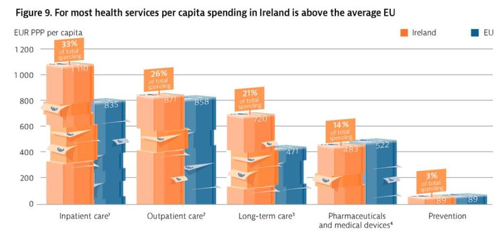
Critique of the original
- Purpose & AudienceCaveat
- Answers “how does Ireland’s per-capita health spend compare to the EU by service?”, but the “% of total spending” callouts bolt on a second story — Ireland’s internal mix — and the editorial title buries the one place Ireland spends less (pharmaceuticals).
- Honesty & CompletenessFail
- The axis does start at zero, but the 3-D extrusion and brick-like banding distort the heights: front faces don’t line up with the gridlines and the fake segments imply a stack that isn’t in the data.
- Encoding & Chart ChoiceFail
- This is a simple two-series comparison (Ireland vs EU across five categories) dressed up as 3-D blocks — depth is a weak, misleading channel, and the most interesting fact, that Ireland spends less on pharmaceuticals, never pops out.
- Clarity over DecorationFail
- Dense chart junk: 3-D perspective, brick banding, drop shadows, and speech-bubble percentage callouts. A great deal of ink renders decoration rather than ten numbers.
- Colour & AccessibilityCaveat
- Orange for Ireland and blue for the EU is a consistent, reasonably colour-blind-safe pairing — the chart’s one real strength — but the 3-D shading muddies the hues and the white callout bubbles add visual noise.
- Layout & FlowCaveat
- Categories run in descending order, which helps, but the doubled encoding (absolute euros plus “% of total”) and the 3-D make the eye work hard for a comparison that should be instant.
Assessment of the original — in detail
Read through the six-lens framework, the original is a fundamentally simple comparison wearing an elaborate costume. The data is just two numbers per category — what Ireland spends and what the EU spends — yet the chart spends most of its ink on perspective, texture, and a second metric nobody asked for.
Purpose & audience. The intended question is reasonable and policy-relevant: in which health services does Ireland spend more or less than the European average, per head? But the “% of total spending” bubbles on the Irish columns answer a different question — how Ireland divides its own budget — and the two stories interfere. The headline (“for most health services… Ireland is above the average EU”) is true but quietly drops the exception that makes the data interesting: pharmaceuticals, where Ireland spends below the EU. Honesty & completeness. To its credit the value axis starts at zero, so the gross magnitudes are not faked. The dishonesty is in the rendering: the 3-D extrusion tilts every column so its front face no longer meets the gridlines, the horizontal brick-banding reads as stacked segments that do not exist in the data, and depth makes a column of 1,110 and one of 835 far harder to rank than a flat bar would. Plotted as plain bars, the same numbers are unambiguous — the distortion is entirely manufactured by the chart style. Encoding & chart choice. At heart this is a textbook grouped comparison: two series, five categories, one quantity. The correct encoding is bar length on a shared baseline, the channel the eye reads most accurately. Instead the values are mapped to the height of 3-D blocks — length plus spurious depth — which is precisely the weak, error-prone channel the framework warns against. The single most newsworthy point, Ireland’s lower pharmaceutical spend, is left to be discovered rather than shown.
Clarity over decoration. The data-ink ratio is poor. Perspective, shadows, brick texture, and five speech-bubble callouts all compete with the ten data points that matter. None of the decoration encodes anything; it is pure ornament, and it actively slows the reader down. This is form overruling function — the chart looks like an infographic and reads like a puzzle. Colour & accessibility. Here the original is at its best: orange for Ireland and blue for the EU is a consistent, reasonably colour-blind-safe pairing that maps cleanly to the two series. The cost is that the 3-D shading darkens and lightens those hues across each block’s faces, so the colour no longer reads as a single flat category, and the white callout bubbles punch holes in the bars. Layout & flow. Ordering the categories from largest to smallest spend is the right instinct and gives the chart a usable left-to-right flow. But that one good decision is swamped: with two numbers, a percentage, perspective, and a callout per category, the layout asks the reader to disassemble each column rather than simply compare two lengths.
The verdict is almost the inverse of a flashy-but-empty chart: the underlying analysis is sound and the colour discipline is good, but the presentation actively obscures it. Strip away the third dimension, drop the second metric, and let length do the work, and the same five comparisons become a five-second read. The two redesigns below do exactly that — one for the absolute levels, one for the gap to the EU.
New visualizations
Two complementary views of the same data: one for the absolute amounts each spends, one for the gap between them. Both are interactive — hover for exact figures, and re-sort the grouped bars.
Scored against the framework
- Purpose & AudiencePass
- One question: in each service, how much does Ireland spend per head versus the EU? The paired bars put the two figures side by side so the answer is immediate.
- Honesty & CompletenessPass
- Zero baseline, true bar lengths, both series shown, every value labelled in euros — nothing is exaggerated or implied.
- Encoding & Chart ChoicePass
- Grouped bars on a common length axis — the strongest pre-attentive channel — so the inpatient and long-term-care gaps, and Ireland’s lower pharmaceutical spend, all read at a glance.
- Clarity over DecorationPass
- Flat 2-D bars, one label each, no perspective, shadows, or callouts. Every mark encodes a number.
- Colour & AccessibilityPass
- Keeps the source’s orange Ireland / blue EU pairing (consistent and CVD-safe) but flattened to a single hue per series, with a legend that matches.
- Layout & FlowPass
- Sorted by Irish spend so the biggest categories anchor the top; sort toggle and hover give optional depth without clutter.
Assessment — in detail
The grouped bar is the deliberately boring redesign, and that is the point: it takes the original’s exact comparison and renders it in the channel the eye reads best, so the five answers arrive almost instantly.
Purpose & audience. It answers one question and answers it cleanly — for each service, how does Ireland’s per-capita spend compare with the EU’s? A policy reader can scan it once and walk away with the shape of the story: Ireland spends more overall (about €3,273 to the EU’s €2,775), the gap concentrated in inpatient and long-term care. Honesty & completeness. Every figure from the source is present, each bar starts at zero, and the lengths are the true values, so a category where Ireland leads by €275 looks exactly two-and-a-bit times longer than one where it leads by €13. There is no second metric, no perspective, and no rounding away of the detail — the numbers are labelled directly. Encoding & chart choice. Two series across five categories is the canonical case for a grouped bar, and length on a shared baseline is the most accurate encoding available. Crucially, the one fact the original hid — that Ireland spends less than the EU on pharmaceuticals and medical devices — is now visible at a glance, because the Irish bar is simply shorter there.
Clarity over decoration. There is nothing to strip away: flat bars, a direct value label on each, a single gridline reference. The data-ink ratio is high and every pixel is doing a job. What the original spent on bricks and bubbles, this spends on legibility. Colour & accessibility. It deliberately keeps the source’s orange-for-Ireland, blue-for-EU convention so a reader who knows the original isn’t relearning the colours — but flattens each to one solid, evenly-lit hue, which is both cleaner and more colour-blind-robust than the shaded 3-D blocks. The legend names the two series so colour is never the only cue. Layout & flow. Sorting by Irish spend puts inpatient care at the top and prevention at the bottom, giving a natural big-to-small reading order, and the sort toggle lets a reader re-rank by the gap instead. Hover reveals the exact euro figures — view-first, drill-down on demand.
Its honest limitation is that it shows levels, not relationships: you can see that Ireland’s inpatient bar is longer, but the size of the gap is something you compute by eye rather than read directly. That is exactly the job the diverging chart takes on next.
Scored against the framework
- Purpose & AudiencePass
- One question: where does Ireland over- or under-invest relative to the EU, and by how many euros per head?
- Honesty & CompletenessPass
- Zero is the EU level — a meaningful baseline, not a truncation — bar length is the true euro gap, and every difference is labelled with its sign.
- Encoding & Chart ChoicePass
- The gap is a length from a fixed origin, and the direction (over- or under-spend) is carried redundantly by both side (right/left of zero) and colour.
- Clarity over DecorationPass
- Bars, one signed label each, one baseline annotation — no gridline clutter, borders, or 3-D.
- Colour & AccessibilityCaveat
- Green for over-spend and orange for under-spend is CVD-reasonable and reinforced by position, but the view collapses Ireland and the EU into a single difference, so the absolute levels live only in the grouped chart.
- Layout & FlowPass
- Sorted by the gap so spending priorities rank top to bottom; view-only with hover for the exact figures — the right interactivity for a ranking.
Assessment — in detail
Where the grouped bar shows how much, the diverging bar shows how different. It subtracts the EU figure from the Irish one for each service, so the chart is entirely about Ireland’s spending priorities relative to the European norm — the question the original’s title gestured at but never let you measure.
Purpose & audience. One question, sharply put: where does Ireland spend more than the EU, where does it spend less, and by how much? For anyone thinking about health policy that relative view is often the one that matters, and here it is the whole chart rather than something to be inferred — inpatient care (+€275) and long-term care (+€249) reach right, pharmaceuticals (−€39) reaches left. Honesty & completeness. The baseline is zero, and zero means “exactly the EU average”, so it is a genuinely meaningful origin rather than a cropped axis. Each bar’s length is the real difference in euros and is labelled with its sign, so nothing is exaggerated and the near-ties (outpatient at +€13, prevention at €0) honestly read as near-zero rather than being puffed up. Encoding & chart choice. Difference-from-a-reference is the textbook case for a diverging bar, and it uses length from a fixed origin — the accurate channel — for the magnitude. Direction is encoded twice over: bars sit right of zero for over-spend and left for under-spend, and the colour echoes the same split, so the over/under reading never depends on hue alone.
Clarity over decoration. Nothing is spent on ornament: one bar and one signed label per category, a single zero line marking the EU level. It is the antithesis of the original’s 3-D bricks — every mark is data, and the comparison is a single left-or-right glance. Colour & accessibility. Green for above and orange for below is a reasonably colour-blind-safe divergence, and because the same meaning is carried by position (left versus right of zero) the chart still works if the colours are indistinguishable. The honest caveat is completeness: by reducing each service to a single difference, the view deliberately sets aside the absolute amounts, which is why it is shown alongside the grouped bar rather than instead of it. Layout & flow. Sorting by the size of the gap turns the chart into a ranked list of priorities, biggest over-spend at the top and the lone under-spend at the bottom, so the reading order is the story. It stays view-only with hover for exact figures — drill-down would add noise to what is essentially a ranking.
Read together, the two redesigns answer the two halves of the original’s muddled question cleanly: the grouped bar says how much Ireland and the EU each spend, and the diverging bar says where, and by how far, Ireland’s priorities diverge from the European norm — the insight the 3-D chart had but hid.
Comparison & conclusion
Grouped bar (absolute spend)
- Shows what Ireland and the EU each spend, in euros.
- Honest zero baseline and a strong length encoding.
- Weakness: the size of each gap must be judged by eye, not read directly.
Diverging bar (gap vs EU)
- Shows where Ireland over- or under-spends, and by how much.
- Zero means the EU level — a genuinely meaningful baseline.
- Weakness: collapses the two series into one difference, hiding the absolute amounts.
Form vs. function. The original’s analysis was sound — the colour discipline (orange Ireland, blue EU) is genuinely good — but the 3-D extrusion, brick banding, and percentage callouts buried it. Both redesigns remove every non-data mark and let bar length carry the comparison, so the same five numbers read in seconds instead of being decoded.
Task-specificity. There is no single “correct” chart: the grouped bar answers how much, the diverging bar answers where, and by how far. Shown together they recover the very insight the original had but hid — that Ireland’s extra spending is a story about priorities (inpatient and long-term care up, pharmaceuticals down), not a uniform “Ireland spends more”.