Data Visualisation · Critique & Redesign
Life Expectancy at Birth
A critique of the original “birthday candle” chart and two interactive redesigns built from the same data — all evaluated through one six-lens framework.
- Dataset
- Life expectancy at birth (years), by sex, EU countries, 2018
- Source
- Eurostat (online data code demo_mlexpec), via the assignment brief
- Method
- Charts and written critique generated with AI from the provided dataset, then reviewed and refined.
The six-lens framework
A reusable checklist applied to every chart below, moving from purpose down to detail.
01Purpose & Audience
- What single question does this visual answer? If you can't name one, it's doing too much.
- Who is the audience, and does the design match their data literacy and decisions?
- Why does it matter — what value or action does it enable?
02Honesty & Completeness
- Does it show all the relevant data, and only the data?
- Are axes, baselines, and scales truthful (e.g. bars starting at zero)?
- Would the numbers, plotted differently, tell a contradictory story? (the Anscombe test)
03Encoding & Chart Choice
- Is the chart type right for the data type and number of variables?
- Does it use accurate, pre-attentive channels (position, length) for the key comparison?
- Could the key insight be read in a single glance — does it pop out?
04Clarity over Decoration
- Is every element earning its place, or is there chart junk (3-D, heavy gridlines, borders)?
- Is form serving function, or has cleverness gotten in the way?
- Are labels, titles, and precision levels appropriate?
05Colour & Accessibility
- Does colour have a specific purpose (sequence, divergence, category, highlight) or is it decorative?
- Is the palette robust to colour-vision deficiency, with redundant encodings (shape + colour)?
- Is contrast sufficient and the palette consistent?
06Layout & Flow
- Does the layout respect natural reading order, with the most important content where attention lands first?
- Is there a logical flow connecting the components?
- Is the right level of interactivity offered (view-only vs drill-able)?
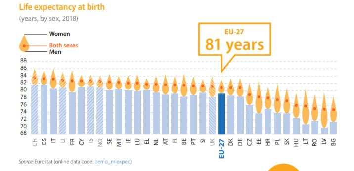
Critique of the original
- Purpose & AudienceCaveat
- Answers “how long do Europeans live, by sex?” but crams three series plus a ranking into one view, so no single question pops out.
- Honesty & CompletenessFail
- The y-axis starts at 68, not zero, exaggerating differences, and the flame’s area encoding distorts magnitude.
- Encoding & Chart ChoiceFail
- Mixes a strong bar (men) with a weak “flame” shape for women and both sexes, so the important sex gap sits in the least readable channel.
- Clarity over DecorationFail
- The birthday-candle motif is decoration over data — a low data-ink ratio, with a lot of orange shape carrying just three numbers.
- Colour & AccessibilityCaveat
- Highlighting EU-27 in blue is good, but the red “both sexes” dot on orange flames is a CVD risk with little redundant encoding, and the pale bars are low-contrast.
- Layout & FlowCaveat
- Descending sort makes the ranking legible and the callout anchors the average, but a single chart is overloaded with three series at once.
Assessment of the original — in detail
Read through the six-lens framework, the original is a chart at war with itself — visually distinctive, genuinely hard to read, and easy to misread. It is memorable as an object but unreliable as evidence.
Purpose & audience. It sets out to answer a reasonable question — how long do Europeans live, and how does that differ by sex across countries — for a general, newspaper-style readership. But it loads three data series (men, women, both sexes) plus a country ranking and an average callout into a single frame, so no one question is allowed to win. A reader who came for “where does my country rank?” and one who came for “how wide is the sex gap?” are handed the same cluttered view, and both have to hunt for their answer. Honesty & completeness. The data is complete and the Eurostat source is properly cited, but the y-axis starts at 68 rather than zero, which inflates the apparent spread between countries — Latvia reads as dramatically worse than the EU-27 average when the true difference is only about five years. The flame’s area encoding compounds the distortion, since area grows faster than the value it stands for. Plotted honestly against a zero baseline, the same numbers would tell a far flatter, less alarming story — the Anscombe warning in miniature. Encoding & chart choice. The comparison that matters most — the male–female gap — is pushed into the weakest possible channel: the length and area of a decorative teardrop. The strong, pre-attentive encoding (the bar) is spent on a single series, while the gap the chart is ostensibly about never pops out. Judging two flame shapes against each other is exactly the angle-and-area estimation the human eye is worst at.
Clarity over decoration. The birthday-candle motif is the textbook “clever over clear” failure. The data-ink ratio is low — a great deal of orange ink renders a shape rather than encoding a number — and the novelty actively slows reading rather than aiding it. Form has overtaken function: the conceit is the first thing you notice and the data is the last. Colour & accessibility. Colour does real work in exactly one place — the EU-27 bar picked out in dark blue — but elsewhere it is a liability. The red “both sexes” dot sitting on orange flames is a red/green accessibility risk with no redundant shape cue to fall back on, so a colour-blind reader can lose the single most important reference point. The pale blue bars also sit at low contrast against the white background. Layout & flow. The descending sort and the average callout are genuine strengths: the ranking is immediately legible and the eye is anchored to the EU-27 reference. But good ordering can’t rescue one static view asked to do the work of three charts — there is no way to isolate the sex gap or a country’s deviation from the norm without the other encodings competing for attention.
The net effect is a graphic that rewards a glance and punishes a read: pleasant to look at, slow to decode, and easy to walk away from with the wrong impression. The two redesigns below each take one of its buried questions — the sex gap, and the gap to the EU average — and give it the honest baseline, the pre-attentive encoding, and the single clear focus the original denied it.
New visualizations
Two approaches to the same data: one focused on the difference between sexes, the other on differences across countries. Both are interactive — hover to reveal every value and re-sort to view the data different ways.
Note: the x-axis starts at 68, not zero, to make the sex gap legible. This compresses the distance between countries — for an honest cross-country comparison, read the diverging chart below.
Scored against the framework
- Purpose & AudiencePass
- One question: how wide is the male–female gap in each country, and who has the widest? “Sort by sex gap” makes that the headline.
- Honesty & CompletenessCaveat
- Shows every country and both sexes, but the x-axis starts at 68 to make the gap legible (disclosed in the caption). Cross-country distances are therefore compressed — the diverging view handles that comparison honestly.
- Encoding & Chart ChoicePass
- The gap is a length on a common position axis — the most accurate pre-attentive channel — not a vague shape.
- Clarity over DecorationPass
- Minimal ink: two dots, a connector, one gap label per row. The “both sexes” diamond is the only extra mark and earns its place as a per-country reference.
- Colour & AccessibilityPass
- Male and female use colour AND shape (teal circle, magenta square), and the legend mirrors those shapes, so the chart survives colour-blindness; the EU line is a distinct dashed highlight.
- Layout & FlowPass
- Sorted top-to-bottom by the active metric, the EU-27 row is banded as the reference, and hover reveals exact values — drill-able where it helps.
Assessment — in detail
The dumbbell is built around one job — make the male–female gap legible — and the framework largely rewards it, with a single honest compromise it discloses rather than hides.
Purpose & audience. It answers one sharp question: how wide is the life-expectancy gap between women and men in each country, and who has the widest? The “sort by sex gap” control makes that the headline rather than an afterthought, and a general reader can act on it at a glance — the Baltics fan open, the Mediterranean countries close ranks. Honesty & completeness. Every country and both sexes are shown, the EU-27 reference is marked, and hovering reveals the exact figures. The one compromise is the truncated x-axis (starting at 68, not zero), which is needed to make a five-year gap visible at all but does compress the distance between countries — so the redesign discloses it in a caption and points readers to the diverging chart for honest cross-country comparison, rather than letting the truncation mislead in silence. Encoding & chart choice. The gap is encoded as length along a common position axis — the most accurate, pre-attentive channel there is — instead of the original’s flame area. Two countries’ gaps compare directly by the length of the connector, and the direction (women always longer-lived) is consistent and instantly readable.
Clarity over decoration. The ink is minimal and every mark earns its place: two dots, a connector, and one gap label per row. The only extra mark, the grey “both sexes” diamond, carries a genuine third value — the country aggregate — rather than ornament. No 3-D, no heavy gridlines, no chart junk. Colour & accessibility. Male and female are separated by colour and shape together — a teal circle versus a magenta square — and the legend mirrors those shapes, so the chart survives colour-vision deficiency without leaning on hue alone. The EU-27 line is a distinct dashed highlight rather than a fourth competing colour. Layout & flow. Rows sort top-to-bottom by whichever metric is active, the EU-27 row is banded as the anchor, and the interactivity is pitched correctly — drill-able on hover for exact values, but never so busy that the static view stops working. The sort toggle reframes the same data without adding clutter.
The honest verdict: it does the one thing it sets out to do well, and is candid about the single distortion it accepts to do it. Its real limit is scope — it is the right tool for the sex gap and the wrong one for ranking countries by absolute longevity, which is exactly the gap the diverging chart fills.
Scored against the framework
- Purpose & AudiencePass
- One question: which countries sit above or below the EU average, and by how much?
- Honesty & CompletenessPass
- The baseline is the EU-27 average — a meaningful zero, not a truncation — bar length is the true deviation, and the EU row is excluded because it is the baseline.
- Encoding & Chart ChoicePass
- Deviation is a bar length from a fixed origin; direction (above/below) is redundant in both position (left/right) and colour.
- Clarity over DecorationPass
- Bars, one value label each, one baseline annotation. No gridline clutter, borders, or 3-D.
- Colour & AccessibilityCaveat
- Green/orange divergence is reasonably CVD-safe and never relies on colour alone (left/right position carries the same signal) — but it hides the male/female split, by design.
- Layout & FlowPass
- Sorted longest-first so the extremes anchor top and bottom; view-only with hover detail — the right interactivity for a ranking.
Assessment — in detail
The diverging bar trades breadth for an honest, single-question answer: which countries sit above or below the EU average, and by how much. On the framework it is the cleaner of the two redesigns, with one deliberate omission.
Purpose & audience. It answers one question and only one — how does each country compare to the EU-27 average, and by how many years? For a reader placing their own country against the European norm the answer is immediate: green to the right is above average, orange to the left is below, and length is the size of the difference. Honesty & completeness. This is where it most outperforms the original. The baseline is the EU-27 average — a meaningful zero rather than a truncation — so bar length is the true deviation and nothing is visually exaggerated. The EU row itself is excluded because it is the baseline, not a competing bar, and every value is labelled. There is no second story the numbers could tell if plotted more fairly. Encoding & chart choice. Deviation is encoded as bar length from a fixed origin, and the all-important direction (above or below the norm) is carried redundantly by both position (left/right of zero) and colour — so the key split reads in a single glance and never depends on colour alone.
Clarity over decoration. Bars, one value label each, and one baseline annotation — nothing more. No gridline clutter, no borders, no 3-D, no decorative motif. The data-ink ratio is high and the form is entirely in service of the comparison. Colour & accessibility. Green for above and orange for below is a reasonably colour-blind-safe divergence, and it is reinforced by left/right position, so the meaning survives even if the hues are indistinguishable. The honest caveat the framework surfaces is not the palette but completeness: by collapsing to a single both-sexes figure, this view deliberately sets aside the male/female split that the dumbbell exists to show. Layout & flow. Sorted longest-first, the extremes anchor the top and bottom and the eye travels down through the ranking to the EU baseline in the middle. The interactivity is view-only with hover detail — exactly right for a ranking, where drill-down would add noise rather than insight.
The honest verdict: as a cross-country comparison it is rigorous and hard to misread, the mirror image of the dumbbell’s strength. Its one real cost is the male/female detail it sets aside — which is why the two redesigns are shown together rather than as competitors: each answers cleanly the question the other has to mute.
Comparison & trade-offs
Dumbbell (sex-gap focus)
- Encodes quality with a common position axis.
- Makes the male–female gap a legible length, not a shape.
- “Sort by gap” adds analytical utility without clutter.
- Weakness: the dense, truncated axis can inflate visual differences between countries.
Diverging bar (country-differences focus)
- Anchors to the EU-27 average to spot above/below at a glance.
- Transparent about scale — the baseline is meaningful, not truncated.
- Weakness: frames countries as deviations from a benchmark and hides the male/female breakdown.
Form vs. function:the redesigns optimize for clarity and accuracy by removing non-essential visuals, whereas the original optimized for visual attention — though who doesn’t like birthday candles?
Task-specificity:the dumbbell is better for exploring the age difference across sexes; the diverging bar is better for quick comparisons across countries. There is no “correct” visualization — effectiveness is determined by the question being asked.