Data Visualisation · Critique & Redesign
Organic Farming — Share of Agricultural Land
A critique of the grass-themed original — decorative bars and a giant average “blob” — and two clean redesigns of the same one-number ranking, each evaluated through one six-lens framework.
- Dataset
- Share of total organic area in total utilised agricultural area (%), 2018
- Source
- Eurostat (online data code org_cropar), via the assignment brief
- Method
- Charts and written critique generated with AI from the provided dataset, then reviewed and refined.
Key finding
Organic land is about 7.5% of EU farmland, but the spread is enormous — Austria leads near 24% while a long tail of countries sits below the average. The data is a simple ranking the original buries under grass blades and a giant average blob.
The six-lens framework
A reusable checklist applied to every chart below, moving from purpose down to detail.
01Purpose & Audience
- What single question does this visual answer? If you can't name one, it's doing too much.
- Who is the audience, and does the design match their data literacy and decisions?
- Why does it matter — what value or action does it enable?
02Honesty & Completeness
- Does it show all the relevant data, and only the data?
- Are axes, baselines, and scales truthful (e.g. bars starting at zero)?
- Would the numbers, plotted differently, tell a contradictory story? (the Anscombe test)
03Encoding & Chart Choice
- Is the chart type right for the data type and number of variables?
- Does it use accurate, pre-attentive channels (position, length) for the key comparison?
- Could the key insight be read in a single glance — does it pop out?
04Clarity over Decoration
- Is every element earning its place, or is there chart junk (3-D, heavy gridlines, borders)?
- Is form serving function, or has cleverness gotten in the way?
- Are labels, titles, and precision levels appropriate?
05Colour & Accessibility
- Does colour have a specific purpose (sequence, divergence, category, highlight) or is it decorative?
- Is the palette robust to colour-vision deficiency, with redundant encodings (shape + colour)?
- Is contrast sufficient and the palette consistent?
06Layout & Flow
- Does the layout respect natural reading order, with the most important content where attention lands first?
- Is there a logical flow connecting the components?
- Is the right level of interactivity offered (view-only vs drill-able)?
01 The original
Critique of the original
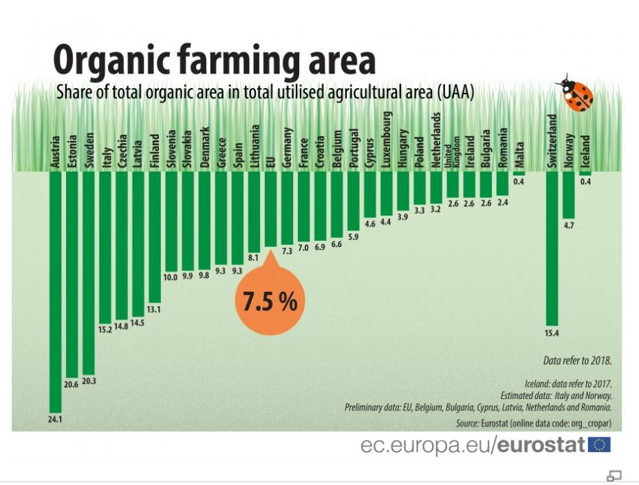
- Purpose & AudienceCaveat
- It answers “which countries farm most organically?”, but the giant 7.5% “blob” promotes the EU average over the actual story — the leaders and the spread.
- Honesty & CompletenessCaveat
- Bars start at zero and are roughly proportional, but the textured grass and the oversized average blob distort visual weight, and the non-EU outliers are split off to the side where they read oddly.
- Encoding & Chart ChoiceCaveat
- Bar length is the right channel, but vertical country labels and tiny value text mean the ranking can't be read at a glance.
- Clarity over DecorationFail
- Heavy chart-junk: grass blades, a ladybug, a textured field background and a large orange blob spend most of the ink on theme rather than data.
- Colour & AccessibilityCaveat
- Green is decorative, not functional — every bar is the same hue — and the one colour accent (the orange blob) is spent on the least interesting number, the average.
- Layout & FlowCaveat
- Sorting descending is the right instinct, but vertical labels, split-off outliers and minuscule values make the layout work harder to read than it should.
Assessment of the original — in detail
The data here is about as simple as a chart can get — one percentage per country — yet the original spends almost all of its effort on a farm-themed costume rather than on the ranking underneath.
Purpose & audience. The question is clear and worth asking: what share of each country's farmland is organic, and who leads? But the design pushes a giant “7.5%” blob — the EU average — into the centre of the frame, so the eye is drawn to the one number that isn't the story, while the leaders (Austria, Estonia, Sweden) are left as ordinary green bars to be hunted for. Honesty & completeness. To its credit the bars start at zero and lengths are broadly proportional. The dishonesty is softer: the textured grass and the inflated average blob add visual weight that the data doesn't, and the non-EU countries (Switzerland, Norway, Iceland) are split off to the right where they read like a different chart, making the overall comparison harder to trust at a glance. Encoding & chart choice. A bar chart is actually the correct choice — length on a common baseline is exactly right for a one-number ranking. The failure is everything layered on top: the country names run vertically and the values are set in tiny type, so the encoding that should let you read the order instantly is buried.
Clarity over decoration. This is the textbook low-data-ink chart. Grass blades, a ladybug, a textured field and the oversized blob are pure ornament; none of them encode anything. The result is pleasant as an illustration and slow as a chart — form has comprehensively overrun function. Colour & accessibility. Colour does no analytical work. Every bar is the same green because the theme demands it, so colour can't distinguish, rank or highlight anything, and the single accent — the orange blob — is spent on the average rather than on a country worth noticing. Layout & flow. Ordering the countries from most to least organic is the one sound layout decision. But vertical labels force the reader to tilt their head, the split-off outliers break the single clean ranking, and the tiny value labels mean precise comparison is a chore.
Strip away the grass and the blob and the chart almost designs itself: a plain, sorted bar with readable labels says everything the original does, in a fraction of the time. The two redesigns below do exactly that — one as a bar ranking, one as a lighter lollipop.
02 Redesigns
Two ways to fix it
Two clean takes on the same ranking: a sorted horizontal bar with direct value labels, and the same values as a lighter lollipop.
Redesign 1 — Horizontal bar (ranking)
Scored against the framework
- Purpose & AudiencePass
- One question, front and centre: rank the countries by organic share of farmland.
- Honesty & CompletenessPass
- Zero baseline, true bar lengths, every country shown with the EU average kept in line as a reference rather than a floating blob.
- Encoding & Chart ChoicePass
- Horizontal bars put length on a common axis and let the country names sit on one readable line; each value is labelled directly.
- Clarity over DecorationPass
- No grass, no blob, no texture — flat bars and one label each. Every mark is data.
- Colour & AccessibilityPass
- A single restrained hue does the whole job; nothing is coloured for decoration.
- Layout & FlowPass
- Sorted top-to-bottom, horizontal so labels read naturally, with hover for the exact figure.
Assessment — in detail
The horizontal bar is the deliberately plain redesign: it keeps the original's one correct decision — sorting the countries by their share — and throws away everything else.
Purpose & audience. It answers the single question the data poses and nothing more — how does each country rank on organic share? A reader scans it once and leaves with the shape of it: Austria far out in front near a quarter of all farmland, a long tail of countries below the EU's 7.5%. Honesty & completeness. Every country from the source is present, each bar starts at zero, and the EU average sits in the ranking as just another bar rather than an inflated graphic, so it can be compared fairly against the members it summarises. Encoding & chart choice. One number per category is the canonical case for a bar, and length on a shared baseline is the most accurate encoding there is. Turning the bars horizontal lets the country names sit straight and readable, and a direct value label removes any guesswork.
Clarity over decoration. There is nothing to strip away: flat bars, a single gridline, one label apiece. The data-ink ratio is high and the ranking reads in seconds — the exact opposite of the grass-and-blob original. Colour & accessibility. A single, evenly-lit hue carries every bar, which is both cleaner and more colour-blind-robust than a themed palette. Because rank is encoded by position and length, colour is free to stay quiet. Layout & flow. Sorted from highest to lowest, the eye travels naturally down the ranking, and hovering reveals the precise percentage — a view-first chart that drills down only when asked.
Its only real limitation is ink: with thirty-plus countries the bars stack up densely. That's the small opening the lollipop redesign takes next.
Redesign 2 — Lollipop (less ink)
Scored against the framework
- Purpose & AudiencePass
- The same ranking question, rendered with even less ink.
- Honesty & CompletenessPass
- Same data, same zero baseline; the dot sits at the true value.
- Encoding & Chart ChoiceCaveat
- Position along the axis carries the value with a thin stem instead of a full bar — a small trade of pinpoint precision for a much cleaner field.
- Clarity over DecorationPass
- Even higher data-ink economy than the bars: a dot and a hairline per country, no heavy blocks.
- Colour & AccessibilityPass
- One restrained hue; no decoration.
- Layout & FlowPass
- Sorted top-to-bottom with readable horizontal labels, the same as the bar.
Assessment — in detail
The lollipop is the same ranking on a diet: it keeps the position encoding that makes the bar honest, but replaces each heavy block with a dot on a hairline, which reads more calmly when there are many countries.
Purpose & audience. It answers the identical question — who farms most organically? — and is especially suited to a long list, where a wall of solid bars can feel oppressive and a field of dots stays light and scannable. Honesty & completeness. Nothing is lost relative to the bar: the same countries, the same zero baseline, and the dot placed at the true percentage, so the ranking and the gaps between countries are reported faithfully. Encoding & chart choice. Value is read from the dot's position on a shared axis, the same accurate channel as a bar's end — the difference is only that the ink between zero and the value is reduced to a thin stem. The honest caveat is that a dot is marginally harder to read to the exact decimal than a filled bar, which is why the value-labelled bar sits alongside it.
Clarity over decoration. This is the leanest version of the chart: a dot and a hairline per country and nothing else. With many rows, that economy makes the overall pattern — the steep leaders, the long tail — easier to take in than thirty solid blocks. Colour & accessibility. As with the bar, a single quiet hue does the work; position and order carry the meaning, so the chart survives colour-vision deficiency without relying on hue. Layout & flow. Sorted highest to lowest with the country names on one readable line, it offers the same top-to-bottom reading order as the bar, just with a lighter visual texture.
Bar and lollipop answer the same question two ways: the bar is best when you want to read exact values, the lollipop when a long ranking should feel airy rather than dense. Either is a five-second read where the grass-themed original was a small puzzle.
03 Verdict
Comparison & conclusion
Horizontal bar (ranking)
- Reads the exact share off a directly-labelled bar.
- Honest zero baseline, strong length encoding.
- Weakness: thirty-plus solid bars stack up densely.
Lollipop (less ink)
- Same ranking with a dot on a hairline — airier for a long list.
- Keeps the position encoding that makes it honest.
- Weakness: a dot is marginally harder to read to the decimal.
Form vs. function. The original's one good decision — sorting the countries — was buried under grass, a ladybug and a giant average blob. Both redesigns keep the sort and drop every non-data mark, so the ranking reads in seconds.
Task-specificity. There is no single “correct” chart: the bar is best for reading exact values, the lollipop for letting a long ranking feel light. Either recovers the leaders and the spread the decoration hid.